7 Color Grading Techniques for Accurate Retouching
Ansu Man | Aug. 19, 2026 | Categories: Retouching | 0 comments
Color grading is often confused with basic color correction, but the two serve different purposes in professional photo retouching. Color correction establishes accurate exposure, white balance, neutral tones, and product color.
Color grading then shapes the visual character of an image by controlling hue relationships, saturation, contrast, and tonal separation. For commercial photography, the challenge is to create a deliberate visual style without changing the perceived color of the actual subject.
This distinction becomes particularly important for e-commerce, fashion, jewelry, automotive, cosmetics, and luxury product photography. An aggressive grade can make gold appear orange, neutral fabrics appear warm, or gemstones appear more saturated than they are.
Professional retouching therefore requires controlled color decisions rather than applying a global filter across the image.
1. Separate Color Correction From Color Grading
The first technical step is to establish a neutral starting point. White balance, exposure, neutral gray values, and unwanted color casts should be addressed before creative grading begins.
For product images, the physical product or an approved color reference should remain the primary reference. This is especially important for jewelry, where lighting and surrounding surfaces can influence the appearance of polished metals and gemstones. Controlled lighting and neutral references help establish a reliable baseline before grading.
Once the image is technically balanced, the retoucher can introduce a controlled color treatment without confusing aesthetic changes with corrections.
2. Control Hue Relationships Instead of Increasing Saturation
Increasing global saturation is one of the easiest ways to make an image look artificially vivid. Professional grading instead examines individual hue ranges and adjusts them selectively.
For a fashion image, for example, a retoucher may refine the relationship between skin tones, garment color, and background rather than increasing saturation across the entire frame. Selective hue adjustments can strengthen color separation while preventing skin from becoming excessively red or orange.
This approach is also useful for cosmetics photography, where a lipstick or foundation shade must remain visually close to the physical product while still fitting the overall visual style.
3. Use Tonal Curves to Shape Color and Contrast
Color grading is closely connected to tonal structure. Curves can be used to control highlights, midtones, and shadows independently, allowing a retoucher to establish contrast without destroying important detail.
A subtle reduction in shadow density can prevent dark areas from becoming muddy, while controlled highlight adjustments can preserve detail in reflective products. The retoucher can also introduce slight color separation into different tonal ranges to create a deliberate visual atmosphere.
This is particularly useful for luxury products where metallic surfaces, dark backgrounds, and specular highlights need to remain visually distinct.
4. Protect Product Colors With Selective Masking
A commercial image may contain several elements that should not receive the same grade. Applying a global adjustment to a jewelry photograph, for example, can alter the gemstone, gold setting, background, and reflection simultaneously.
Manual masking allows the retoucher to isolate individual regions. The background can receive a stylistic adjustment while the jewelry remains color accurate. Similarly, a fashion photograph can receive a cooler environmental grade while the model's skin and garment remain within approved color boundaries.
This localized approach is one of the main reasons professional color grading requires more judgment than applying an automated preset.
5. Maintain Consistent Color Across Product Variants
Color consistency becomes technically challenging when a catalog contains multiple products photographed under different lighting conditions, cameras, or sessions. Even small differences in white balance or exposure can make identical materials appear unrelated.
Retouchers can establish reference values and compare images across a series rather than grading each photograph independently. For apparel, this may involve maintaining consistent reds, blues, neutrals, or skin tones across different poses. For jewelry, metal and gemstone appearance should be checked against an approved physical reference whenever color accuracy is critical.
A consistent workflow is particularly important for e-commerce catalogs because inconsistent color treatment can make a product range appear visually disconnected.
6. Grade Reflective Materials With Extra Caution
Jewelry, automotive paint, glass, polished metal, and other reflective surfaces require specialized color judgment. Their appearance is influenced not only by the object's intrinsic color but also by reflected light, surrounding surfaces, and the color of the environment.
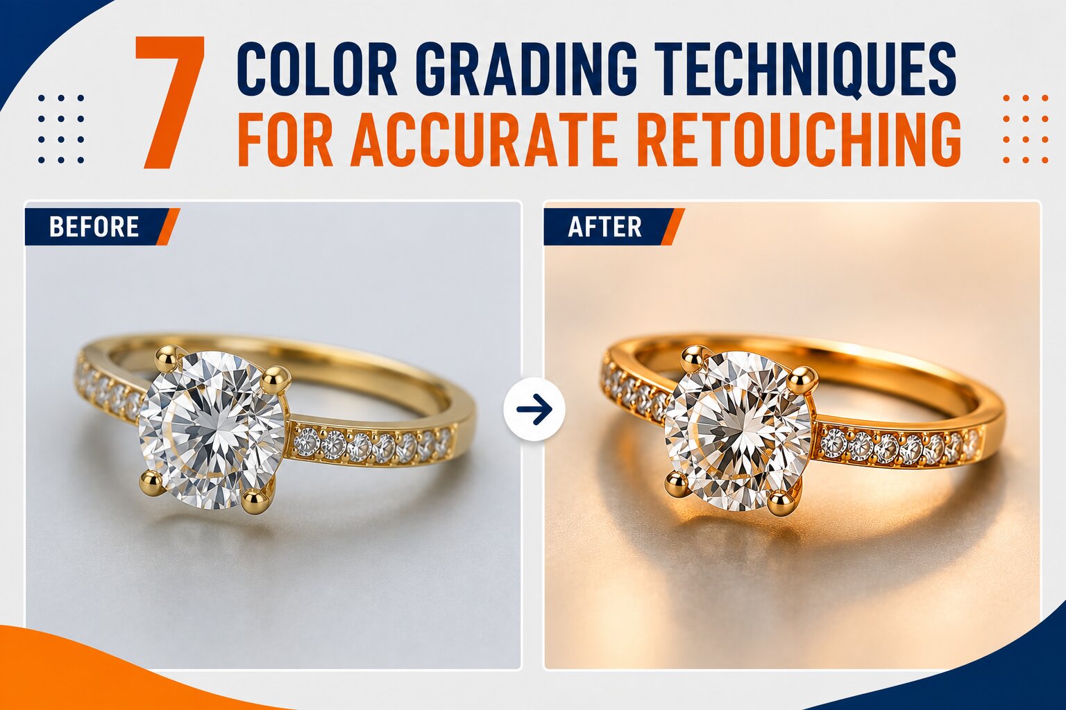
For jewelry, changing the overall warmth of an image can unintentionally shift yellow gold toward orange or make silver appear warmer than it should. Gemstone saturation can also be exaggerated if grading is applied without considering the original lighting conditions.
Professional retouchers therefore isolate reflections, metal surfaces, gemstones, and backgrounds when necessary rather than applying identical color changes to the entire photograph.
7. Use Grading to Establish Style Without Misrepresenting the Subject
The final purpose of color grading should be to establish visual consistency and mood while preserving the identity of the photographed subject. This is where technical retouching differs from simply making an image look more dramatic.
For automotive photography, a controlled cool grade can create a refined environment without changing the vehicle's actual paint color.
In fashion photography, a cinematic tonal treatment can strengthen the campaign aesthetic while keeping skin and fabric colors believable.
In jewelry photography, subtle contrast and background color separation can emphasize brilliance without artificially changing gemstone characteristics.
Manual grading also provides an important advantage over fully automated color enhancement. Automated systems can recognize common visual patterns and apply broad adjustments, but they may not understand whether a particular color represents the product itself, a reflection, a shadow, or a deliberate background element.
Human retouchers can inspect these relationships individually and decide which colors should change and which must remain untouched.
Precision Color Grading Requires More Than a Preset
Effective color grading combines technical correction, selective color control, tonal adjustment, masking, reference matching, and visual judgment. The objective is not simply to produce stronger colors. It is to create a controlled relationship between the subject, background, lighting, and overall visual style.
For e-commerce, jewelry, fashion, cosmetics, automotive, furniture, and luxury product photography, this distinction is critical. A visually attractive grade should still preserve the recognizable characteristics and color identity of the photographed product. Professional retouching provides the localized control needed to achieve that balance.
If your commercial images require consistent color treatment without compromising product accuracy, contact our professional photo retouching team at PicsRetouch for precise color grading tailored to your photography style, product materials, and approved visual references.